Client: Screamin Peach
Screamin Peach Logo Refresh
Branding Design
The Problem
Screamin Peach’s logo and branding were well-liked by customers, but the readability was poor. They wanted a revamped logo and brand look that would preserve their established playful personality, while improving readability and brand recognition.
The Solution
We improved readability and revamped their logo while keeping brand personality and flavor intact.
Before Vs After
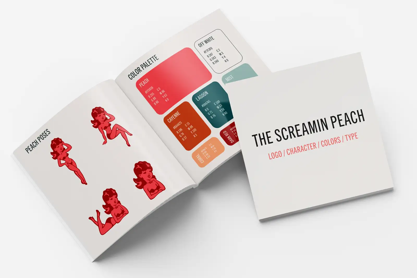
We delivered a final set of refined logos, mascot illustrations, and brand guide with colors and typefaces.
Branding
We provided multiple rounds of updated logo options and an expanded set of mascot illustrations. This allowed them to easily adapt their logo and branding to a wide range of assets from signage to merch.